Our Top 3 Paint Colors + Tips
Tips for selecting a paint color
When it comes to choosing a paint color, it can feel like a daunting task. There are endless options and shades to consider, and the possibilities are truly endless. But here's the good news: paint is one of the most affordable updates you can make to your home, and it has the power to completely transform a space. Here are some of our favorite tips, along with the paint colors we use often in our designs.
Step 01. Start With Inspiration
Start by gathering inspiration—find images of rooms or colors that appeal to you, whether from magazines, websites, or nature. Then, consider the tone of the color—does it feel warm, cool, or neutral? I tend to favor warm tones, as they create a cozy, inviting atmosphere.
Step 02. Narrow Down Your Choices
Once you’ve narrowed down a few colors, select 3-4 that align with your inspiration. This step is key—always swatch the colors in the actual space. Lighting can greatly affect how the color looks on the wall, and it may differ from how it appears in-store.
Step 03. Observe The Color Throughout The Day
After applying the swatches, let them dry fully and observe how they look at different times of the day—morning, afternoon, and evening. The color will change with the light, so take time to see how it evolves. Choose the one that looks best throughout the day. Congratulations, you've found your perfect color!
Step 04. Choose The Right Sheen
Once you’ve picked your color, it’s time to select the right sheen. Here’s a general guide we follow:
Trim & Baseboards: Satin Sheen
Walls: Eggshell / Matte
Ceilings: Flat
These sheens help to create the best finish for each area of your home, offering durability and a beautiful aesthetic.
Choosing the perfect paint color doesn’t have to be overwhelming. With a bit of inspiration, testing, and observation, you can confidently select a color that will bring your vision to life. Happy painting!
Our Top 3 Paint Colors
Greek Villa By Sherwin Williams
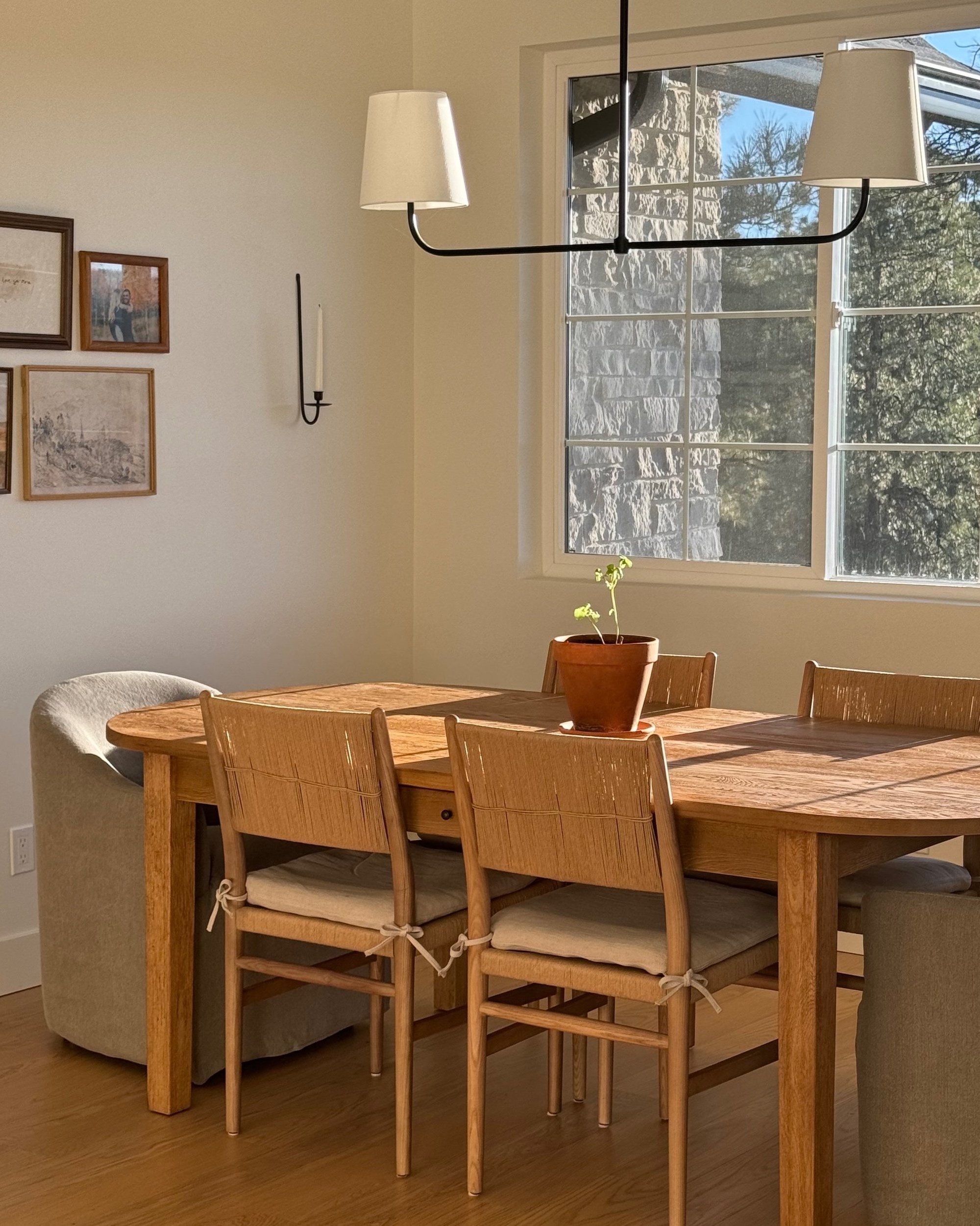
This warm white comes alive in natural light, making it perfect for brightening any room or accentuating other colors when used on trim.
I’ve used it in my own home and love how it looks at all times of the day—it's such a complementary color. It serves as a great base for any design
Shaded White - Farrow & Ball
Shaded White strikes the perfect balance between warm and cool, with a soft grey undertone that remains inviting rather than cold. It’s a versatile choice for both traditional and contemporary spaces.
This color is perfect for cabinetry when you want the crispness of white cabinets, but with a touch of contrast to make them truly stand out.. It’s also stunning on trim, doors, or as an accent to create a beautifully balanced look in any room.
Iron Ore - Sherwin Williams
This deep, cool charcoal brings a refined, understated elegance when used sparingly in well-lit spaces or on exterior surfaces. It’s a rich, balanced color—dark enough to make an impact without being overpowering, and perfectly nuanced, neither too dark nor too grey.


